CASE STUDY
Client: Aunt LuLu’s Country Kitchen (Local Artisan Baker & Farmers' Market Vendor)
Project Scope: Brand Identity Refinement, Mascot Logo Integration, & 5-Variant Packaging System
Deliverables: Logo Refresh, Label Dieline System, 3D Product Mockups, Social Media Marketing Visuals
EXECUTIVE SUMMARY
Aunt LuLu’s Country Kitchen is a local, home-based artisan brand specializing in small-batch pepper jellies sold at regional farmers' markets. The client needed a refreshed, cohesive visual identity and packaging system for her signature line of 5 specialty jellies.
The objective was to jar labels into a clean, modern-rustic packaging architecture that stands out on market tables and retail shelves while remaining cost-effective and easy to print for a small-scale producer.
THE CHALLENGE
Busy Market Environment: Farmers' market shoppers make split-second buying decisions.
Dual Brand Personality: The client wanted the brand to feel warm, nostalgic, and "country-rustic," yet youthful, energetic, and engaging for modern foodies.
Strict Label Constraints: Labels needed to accommodate bilingual text (English & French), volume specifications (250ml), ingredient lists, and storage instructions on a compact jar layout without looking cluttered.
DESIGN SOLUTION & EXECUTION
1. Mascot Logo Integration & Brand Mark
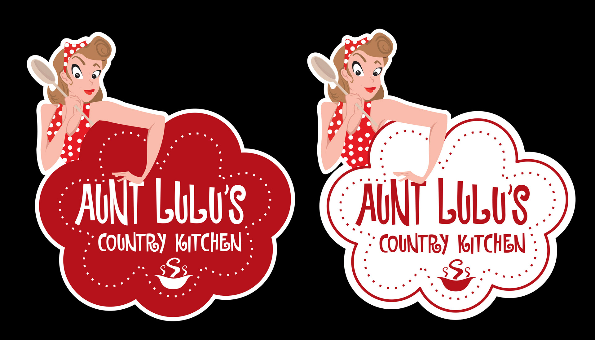
• Retained and polished the beloved retro "pin-up" mascot holding a wooden spoon, setting her inside a soft, cloud-scalloped badge framed by a subtle dot pattern.
• Combined nostalgic mid-century kitchen aesthetics with custom, playful hand-lettered typography for "Aunt LuLu's Country Kitchen."
2. Flavour Architecture & Color System
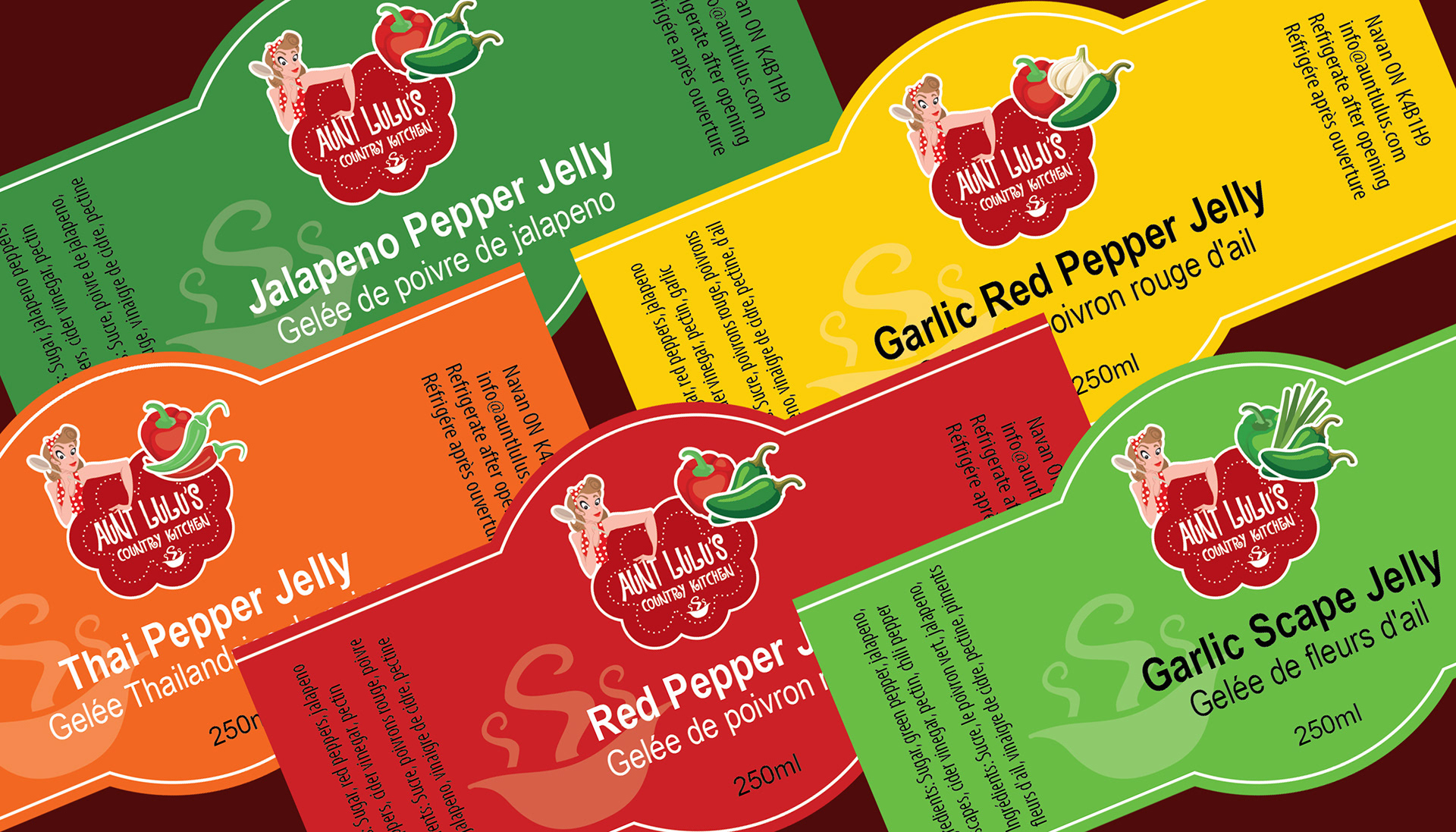
To solve the issue of quick flavour recognition, I established a colour-coded label architecture across the 5 variants:
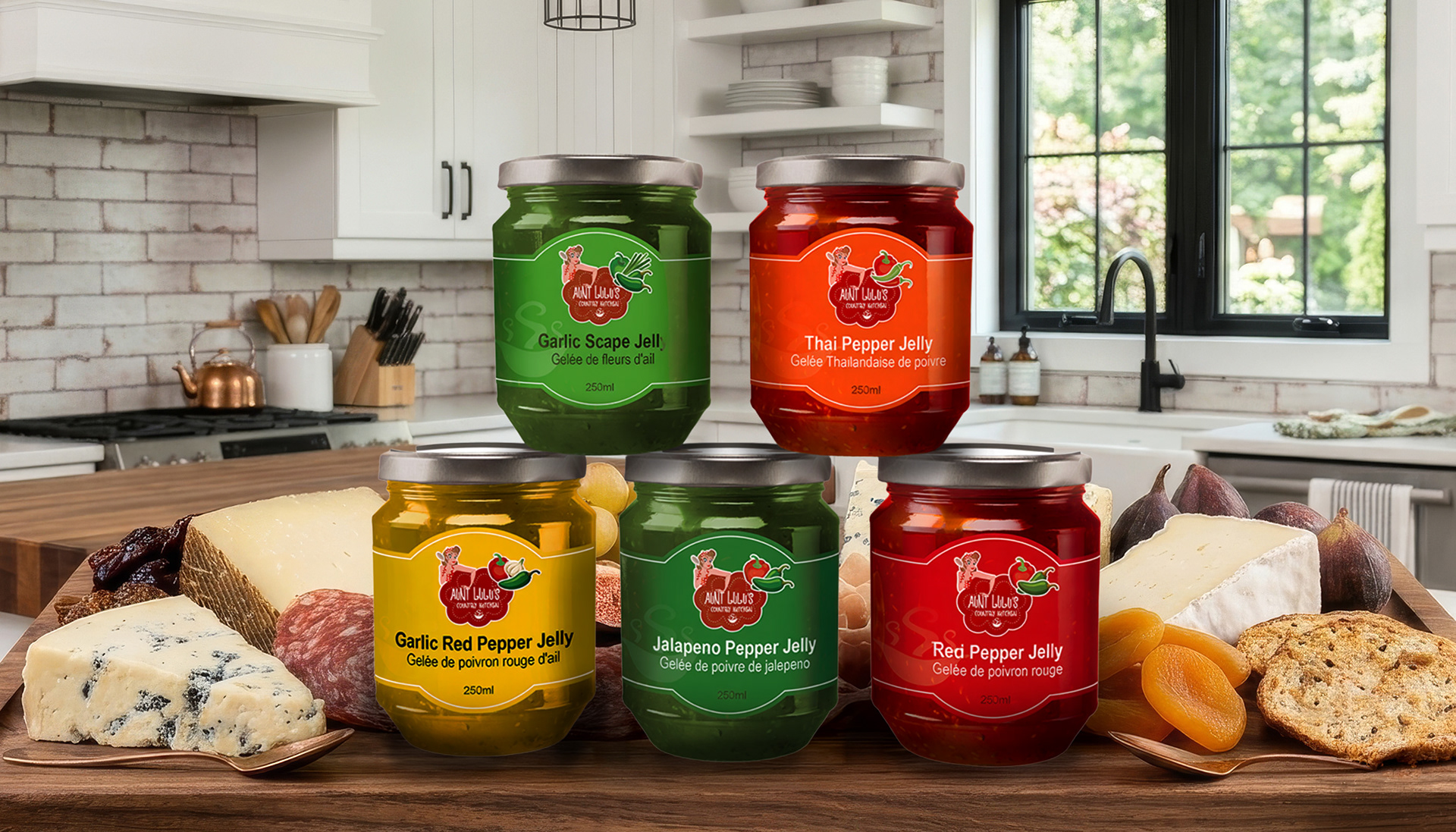
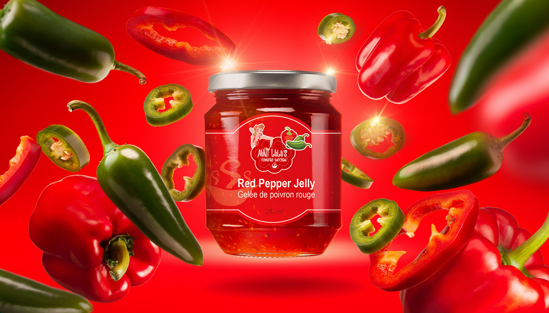
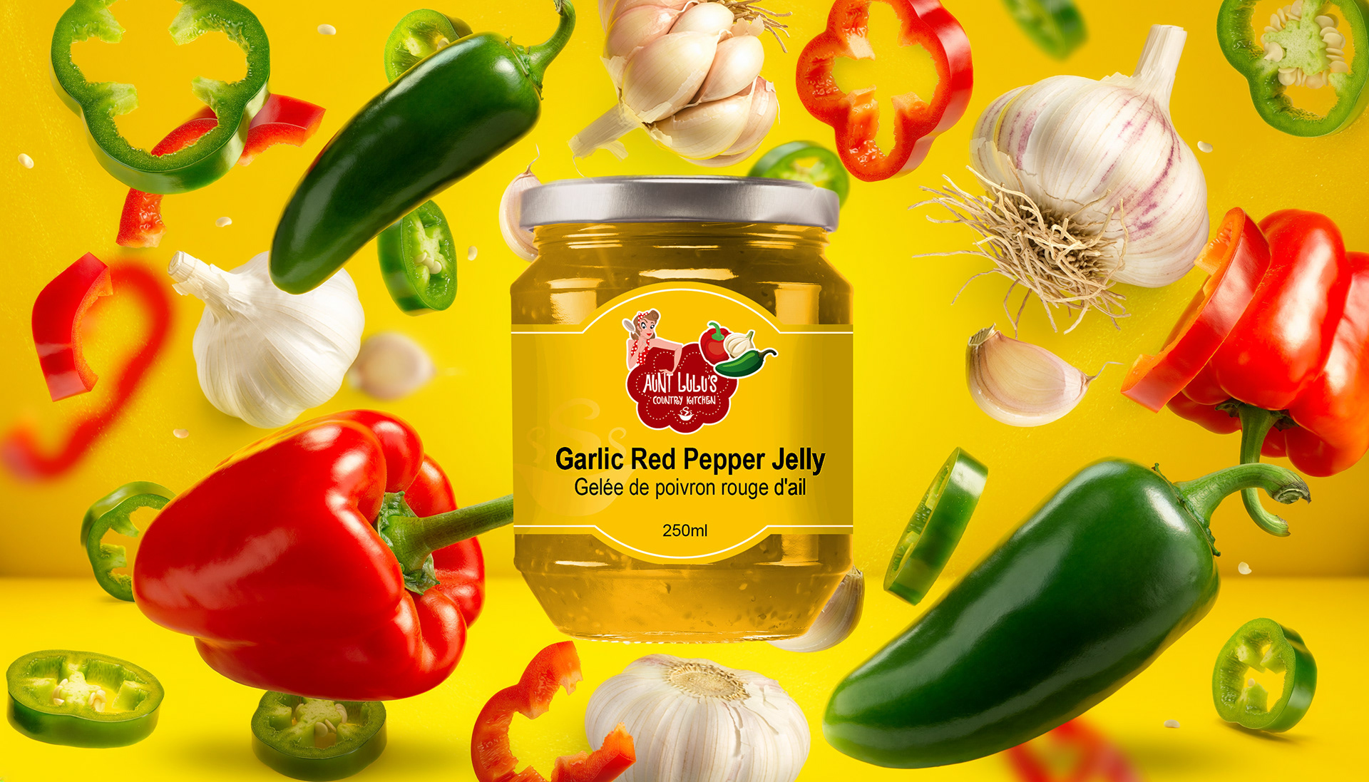
• Garlic Red Pepper Jelly: Warm Harvest Yellow
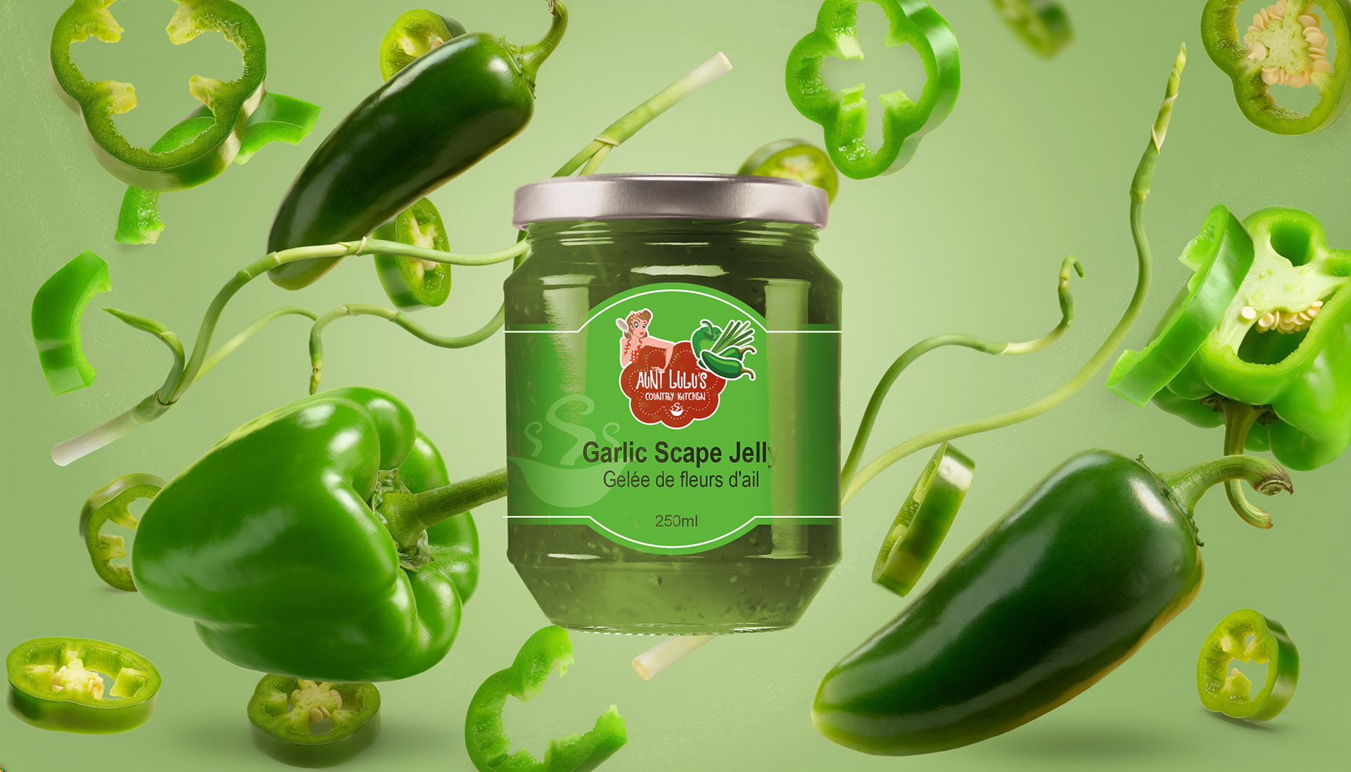
• Garlic Scape Jelly: Fresh Herbal Lime Green
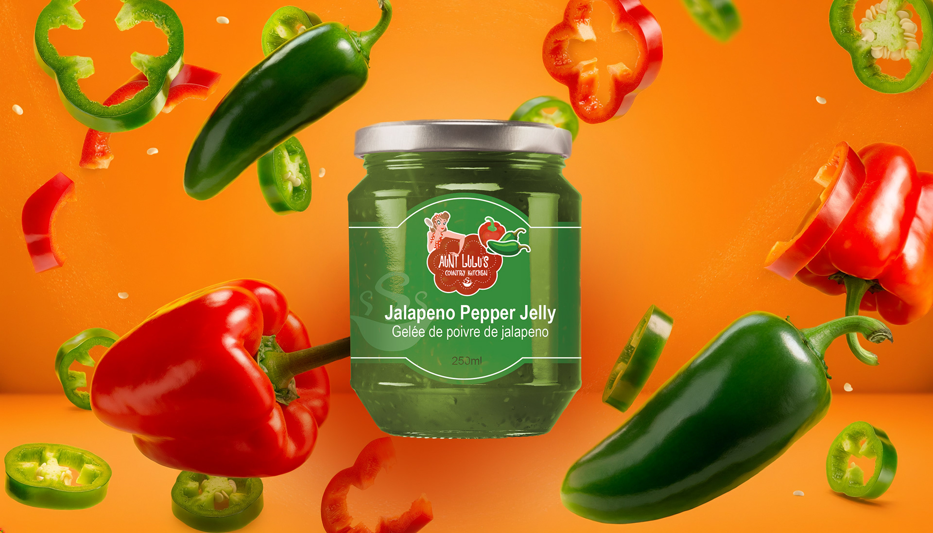
• Jalapeno Pepper Jelly: Deep Garden Green
• Red Pepper Jelly: Vibrant Crimson Red
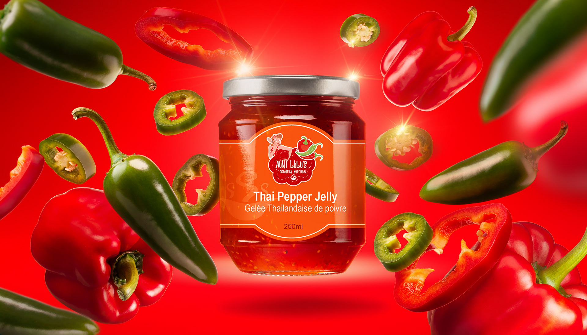
• Thai Pepper Jelly: Zesty Spicy Orange
3. Label Layout & Typography
• Primary Focus: High-contrast, clean typography for the English flavour name with a smaller, elegant sub-heading for the French translation (Gelée de...).
• Side Panel Organization: Structured the required regulatory information (ingredients, bilingual copy, 250ml net volume, and location info) into vertical side bands, leaving the center front clean and readable from a distance.
• Scalloped Arch Header: Designed a distinctive curved top edge for the center label block to mimic classic mason jar labels, adding a bespoke, handcrafted feel.
MARKETING & PRESENTATION ASSETS
To elevate the brand’s digital presence and wholesale pitch deck, I developed a series of high-impact visual assets:
• Dynamic "Exploding Ingredient" Renders: Created motion-inspired studio mockups featuring levitating fresh ingredients (jalapenos, red peppers, garlic bulbs) surrounding the flavour jars against matching colour backdrops.
• In-Context Lifestyle Shot: Designed a warm, country-kitchen scene featuring the full 5-jar lineup alongside a charcuterie board and cracker pairing, demonstrating product usage and lifestyle appeal.
RESULTS & IMPACT
Enhanced Shelf Presence: The colour-coded label architecture dramatically improved product visibility and flavour distinction at farmers' markets.
Scalable Packaging System: Created a flexible label template that allows the client to easily introduce new seasonal flavors while maintaining 100% brand consistency.
Professionalized Wholesale Readiness: Elevated the product presentation from a home-kitchen craft to a retail-ready CPG brand suitable for local specialty grocery boutiques.
Designed in Ottawa, Ontario CA. by Jacquelyn Trowell
Have a project inquiry? Reach out at jacquie@jacquelyntrowell.com
Find me on LinkedIn at https://www.linkedin.com/in/jacquelyn-trowell/
Have a project inquiry? Reach out at jacquie@jacquelyntrowell.com
Find me on LinkedIn at https://www.linkedin.com/in/jacquelyn-trowell/