

CASE STUDY
Brand: Farm Boy
Project Scope: Department Identity System, In-Store Environmental Graphics, & Multi-Channel Touchpoints
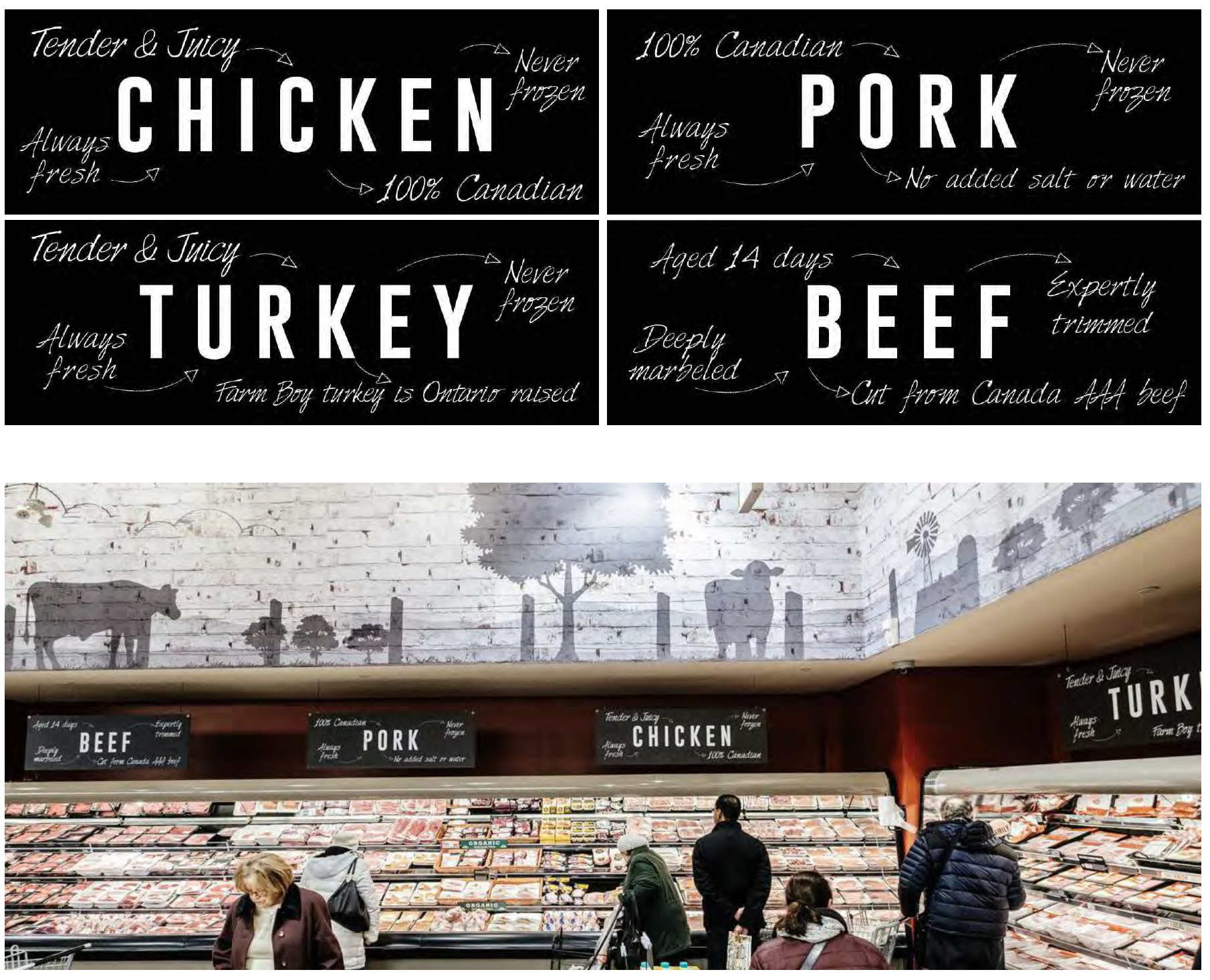
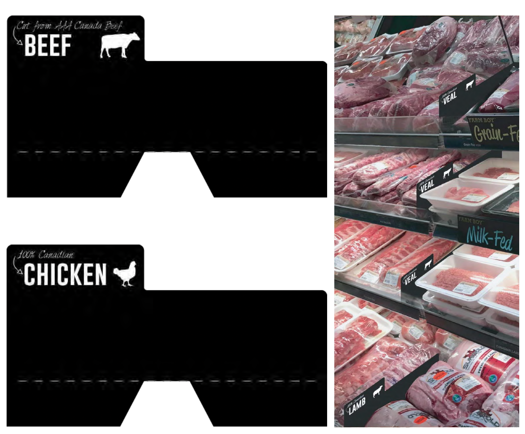
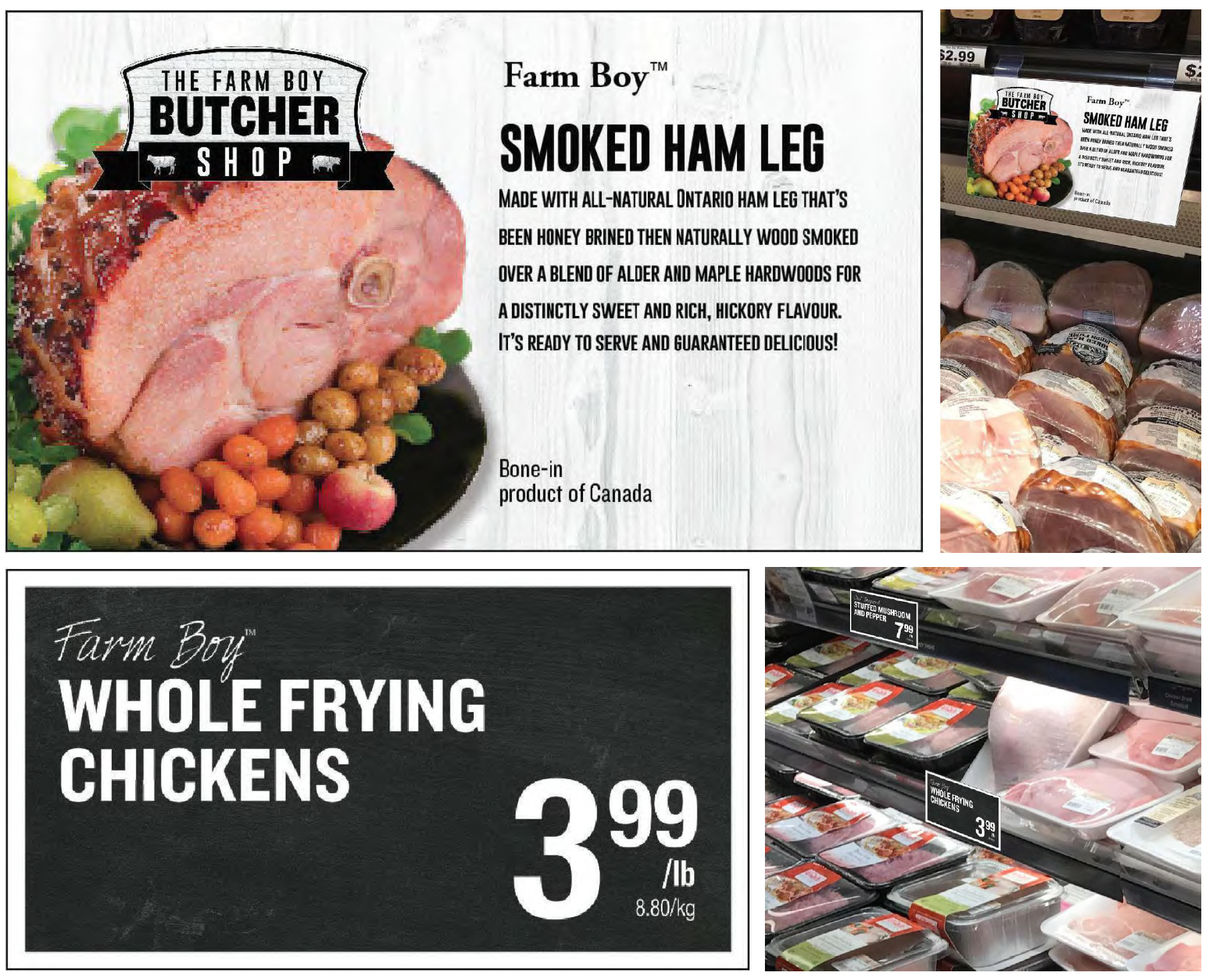
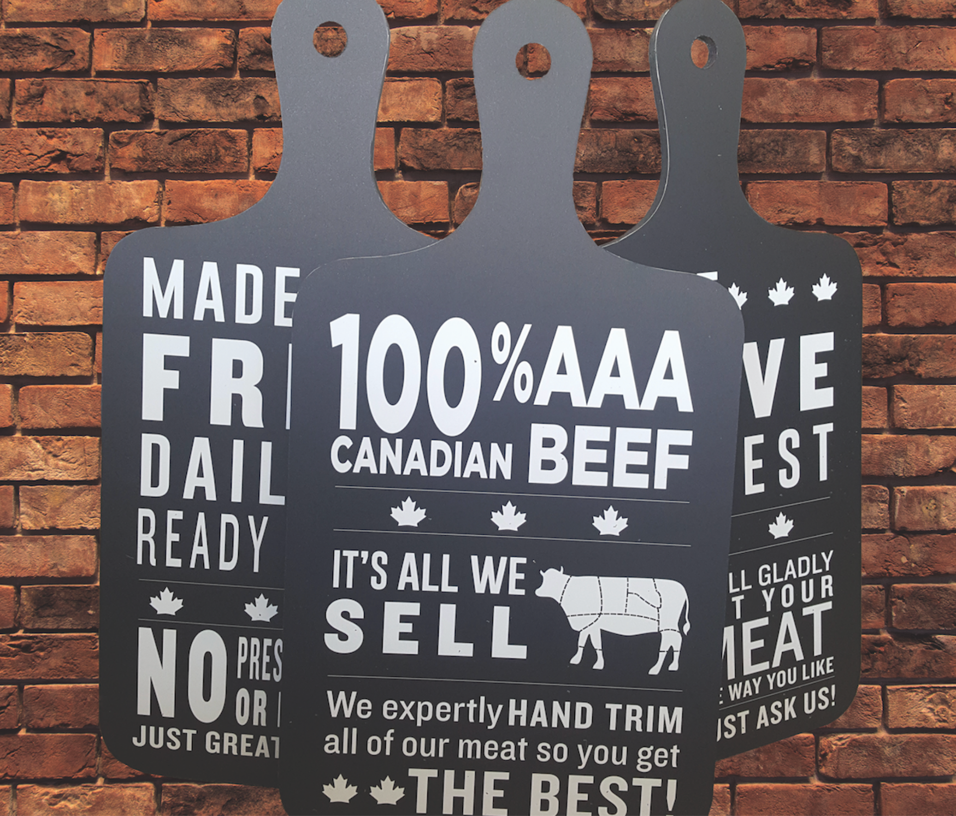
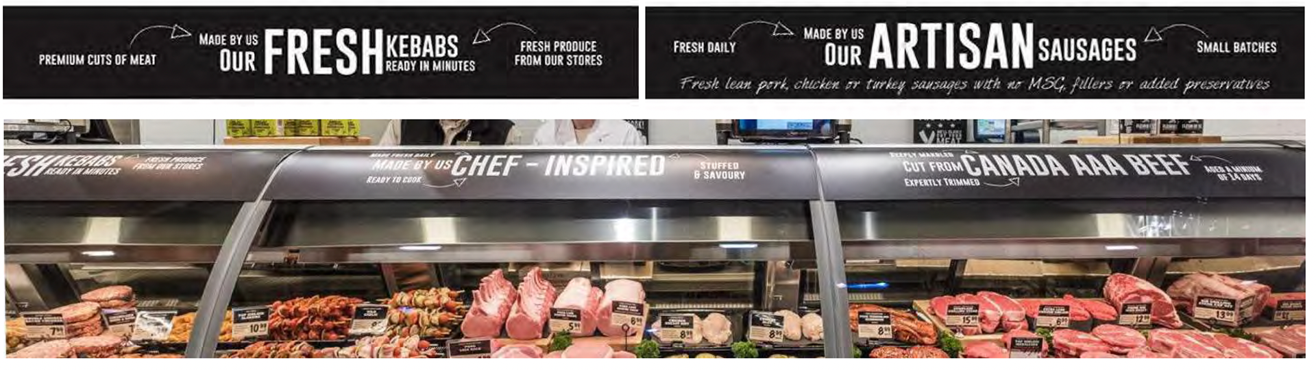
Deliverables: Department Identifiers, Raised Lettering Dimensional Signage, Bulkhead Adaptations, Talking Signs, Shelf Talkers, Meat Labels, Weekly Flyer Branding Assets
EXECUTIVE SUMMARY
Farm Boy’s Meat Department needed a comprehensive brand modernization to stay competitive against both large-scale national grocers and boutique, craft butcher shops. The objective was to refresh the existing visual identity to better communicate Farm Boy’s core values—quality, local Canadian sourcing, and an exceptional butchery experience—while honoring existing brand equity and customer recognition.
THE CHALLENGE
Marketplace Evolution: Retail trends shifted toward artisanal, boutique butcher presentations. The existing department visuals felt dated and failed to convey the premium quality of the product offering.
Spatial & Structural Constraints: Store layouts varied across locations. The primary department identifier needed to scale across massive bulkheads as well as tight, space-constrained wall segments.
Omnichannel Consistency: The updated department branding had to translate seamlessly from physical 3D store signage into 2D print channels (e.g., high-volume weekly flyers).
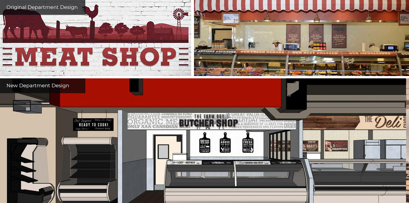
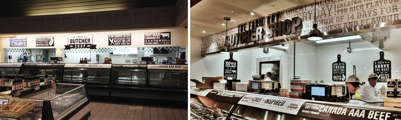

New department identifier (pictured above), produced as separate sections. The main brick shape, ribbon and text in ribbon are produced as one piece with “The Farm Boy Butcher Shop” text is output as raised lettering. This identifier is also used in the weekly flyer to further enforce the department branding. The simplified wordmark versions are used when the bulkhead space is not large enough to place the full version of the identifier.
DESIGN SOLUTION & EXECUTION
1. Core Department Identifier & Dimensional Signage
• Architectural Construction: Designed a modular, multi-piece primary bulkhead identifier. The main brick background silhouette, ribbon banner, and primary text were produced as an integrated base piece.
• Tactile Craftsmanship: To emphasize an elevated "butcher shop" feel, “The Farm Boy Butcher Shop” wordmark was engineered with raised, dimensional lettering. This tactile detail added depth and premium visibility across the store floor.
• Brand Nostalgia & Modernity: Blended classic brickwork imagery with clean, high-contrast typography to reinforce tradition, local craftsmanship, and trust.
2. Scalable System & Environmental Adaptations
• Simplified Wordmark Variations: Developed secondary, stripped-down wordmarks for store layouts where bulkhead height or width was restricted, ensuring 100% visual consistency regardless of footprint.
• Production-Ready Guidelines: Specified materials, print substrates, and dimensional layering parameters to ensure smooth execution across new store openings and departmental retrofits.
3. Cross-Channel Integration
Weekly Flyer Branding: Adapted the 3D environmental signage into crisp vector assets for Farm Boy’s weekly print and digital flyers, creating an immediate visual bridge between home marketing and the in-store shopping experience.
RESULTS & IMPACT
Elevated Brand Perception: Successfully repositioned Farm Boy's meat section from a standard supermarket aisle to an artisanal "Butcher Shop" destination.
Unified Customer Touchpoints: Established seamless visual alignment between weekly promotional print material and physical in-store navigation.
Modular Rollout: Provided an adaptable signage system that streamlined store setup for creative and production teams during store expansions.

Location Murals
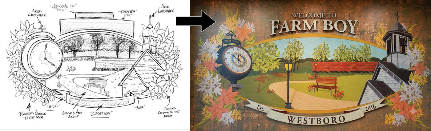
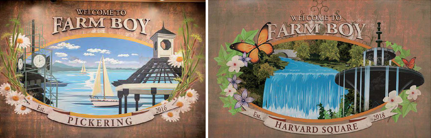
SCOPE: Design a large-scale "Welcome" mural template to enhance the local feel of new store openings, aligning with the brand’s community-focused core.
As both a traditional and digital artist, I developed the project from initial hand-rendered concept sketches to final digital layouts. The inaugural installation in Westboro (Ottawa) successfully captured distinct regional landmarks, including the historic Town Hall, the Rotary clock, and a local park scene, establishing the framework for all future location rollouts.

Annual Coupon Book
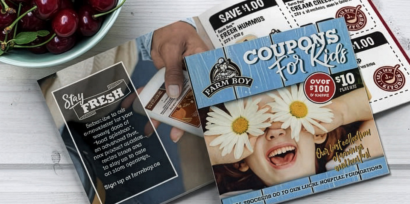
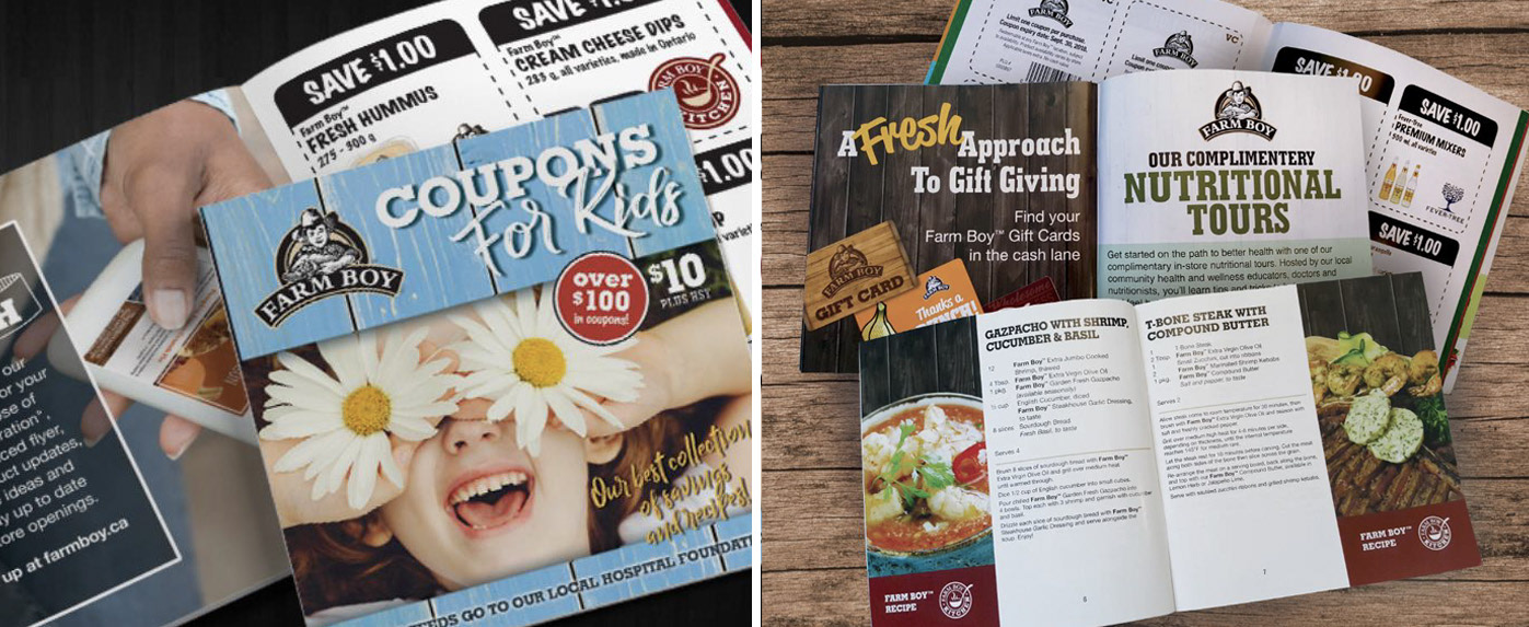
This comprehensive annual campaign involved designing the book's cover and layout, followed by a full suite of marketing materials. To support the 10 benefiting hospitals, I managed and coordinated dozens of regional graphic variations, requiring exceptional organization and teamwork to ensure every location received tailored assets.

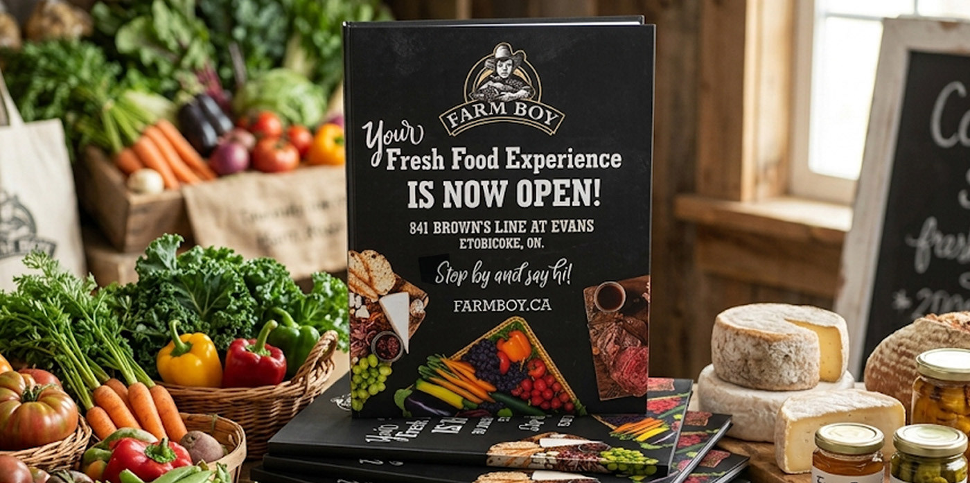
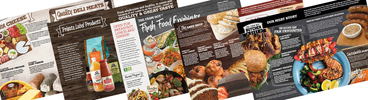
New Market Introductory Publication
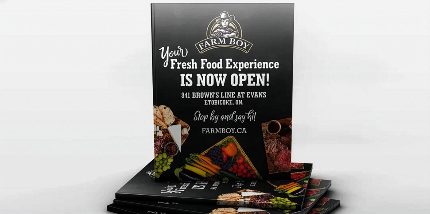
Farm Boy is a local fresh food market that supports local farmers and food artisans across Ontario. As they expand into new territories that may not know about them, this magazine is used as an informational tool to communicate who they are and what they are about.
Designed in Ottawa, Ontario CA. by Jacquelyn Trowell
Have a project inquiry? Reach out at jacquie@jacquelyntrowell.com
Find me on LinkedIn at https://www.linkedin.com/in/jacquelyn-trowell/