

CASE STUDY
Children's Book: Mango the Lonely Polar Bear
Author: Caroline Séguin (Independent Author)
Project Scope: Full Children’s Book Illustration, Visual Layout & Editorial Design, Character Styling, Amazon KDP Print & Digital File Preparation
Target Audience: Infants to 7 Years Old
Deliverables: Cover Design, Full-Bleed Story Spreads, Typesetting, Print-Ready & e-Book Files
EXECUTIVE SUMMARY
A local independent author approached me to bring her children's story, Mango the Lonely Polar Bear, to life. The project required a complete end-to-end creative workflow—from initial character development and full-page illustrations to typesetting, cover design, and prepress prep for Amazon Direct Publishing (KDP). The goal was to create an engaging, accessible picture book that appeals to early childhood readers while maintaining a warm, endearing tone.
THE CHALLENGE
Age-Appropriate Tone & Character Styling: The target audience spanned from infants up to seven years old. The character designs needed to feel friendly, warm, and expressive without leaning into hyper-cartoonish tropes.
High-Contrast Visual Engagement: Young children respond strongly to bold visual cues. The color palette required high saturation and vibrancy to maintain reader engagement across every spread.
Self-Publishing Technical Constraints: Preparing files for Amazon KDP print-on-demand requires precise bleed, margin management, gutter preservation, and color profile setup to prevent trimming errors and ensure color accuracy.
DESIGN SOLUTION & EXECUTION
1. Character Design & Narrative Styling
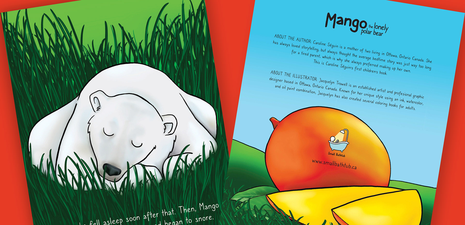
• Endearing Character Realism: Developed soft, approachable character forms for Mango (the polar bear cub), the black bear family, and tropical elements like mango trees. The bears feature gentle facial expressions and natural textures, striking the ideal balance between emotional warmth and believable anatomical structure.
• Vibrant Palette & Visual Storytelling: Utilized high-contrast, rich colors—electric sky blues, deep greens, tropical oranges, and warm yellows—to contrast cold polar environments with warm tropical themes, creating a visually stimulating experience on every page.
2. Layout, Typography & Visual Flow
• Accessible Typography: Selected a clean, rounded, handwritten-style sans-serif font for the narrative text. The typography provides high contrast against backgrounds to ensure effortless legibility for early readers and parents reading aloud.
• Dynamic Spread Composition: Designed seamless full-bleed double-page spreads. Placed visual focal points strategically around text blocks to support story comprehension for pre-readers who rely on artwork to follow along.
3. Prepress & Amazon KDP Optimization
• Print-Ready Preparation: Formatted all artwork and typography to exact print-on-demand specs, including CMYK color space optimization, 300 DPI high-resolution exports, precise gutter allowances, and trim safety zones.
• Full Cover & Interior Package: Delivered finalized PDF print files for physical paperback distribution alongside reflowed digital assets for Kindle digital publishing.


RESULTS & IMPACT
• Turnkey Author Success: Provided the independent author with a complete, publication-ready package that uploaded seamlessly to Amazon KDP without pre-flight errors.
• Engaging Reading Experience: Created a visually memorable picture book that captures young children's attention through vibrant artwork, gentle character design, and clear text placement.
Designed in Ottawa, Ontario CA. by Jacquelyn Trowell
Have a project inquiry? Reach out at jacquie@jacquelyntrowell.com
Find me on LinkedIn at https://www.linkedin.com/in/jacquelyn-trowell/